Optimal Font Size And Style For Resumes: Your Guide
Did you know that the font size and style you use on your resume can make a significant impact on your chances of landing your dream job? Recruiters and hiring managers receive hundreds of resumes, and having one that is easy to read and visually appealing can make you stand out from the crowd. In this guide, we will discuss the optimal font size and style for resumes to help you create a professional and eye-catching document that impresses potential employers.
Importance of Choosing the Right Font Size and Style
Choosing the right font size and style is crucial for creating a resume that is easy to read, visually appealing, and professional. Here are some reasons why:
- Easy readability: Recruiters and hiring managers often have limited time to review resumes, so choosing a font size and style that is easy to read can make a big difference. A font that is too small or too fancy can make your resume difficult to read and cause the recruiter to move on to the next candidate.
- Professionalism: A well-designed resume that uses an appropriate font size and style shows that you take the job application seriously and have put effort into creating a professional document that represents you well.
- Visual appeal: An eye-catching resume can make a strong first impression and increase your chances of getting an interview. Choosing a font size and style that is visually appealing while still being professional can help your resume stand out from the rest.
Choosing the Right Font Size
The optimal font size for resumes is between 10 and 12 points. This size is easy to read and doesn’t take up too much space on the page. However, you can adjust the font size slightly depending on the font style you choose.
If you choose a font style that is more condensed, such as Arial Narrow or Calibri Narrow, you may need to increase the font size to 12 or 13 points to ensure that it is still easy to read. On the other hand, if you choose a font style that is more spread out, such as Verdana or Tahoma, you may be able to use a slightly smaller font size, such as 10 or 11 points.
Choosing the Right Font Style
When it comes to font style, it’s best to choose a classic and professional font that is easy to read. Here are some font styles that are commonly used for resumes:
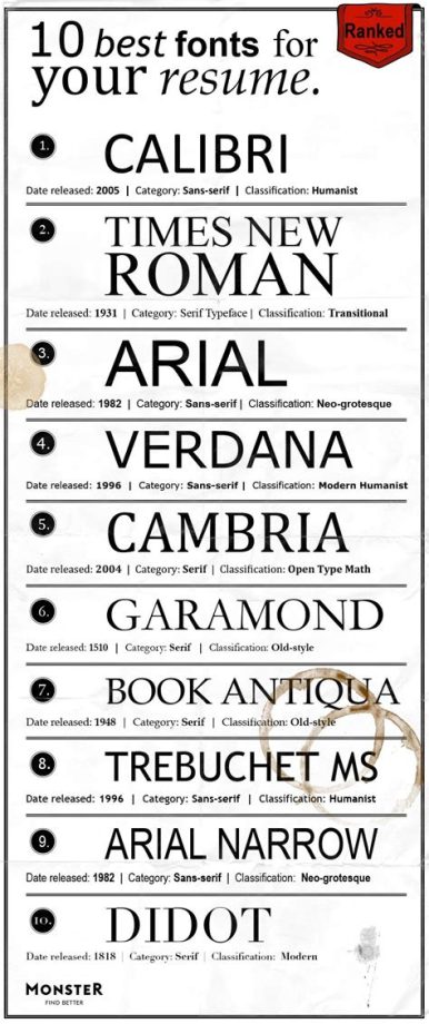
- Times New Roman: This font style is a classic and professional choice that is easy to read. It is a serif font, which means it has small lines or flourishes at the end of each letter. This font style is a good choice for more traditional industries, such as law, finance, or academia.
- Arial: This font style is a sans-serif font, which means it does not have small lines or flourishes at the end of each letter. It is a modern and clean font that is easy to read and works well for a variety of industries.
- Calibri: This font style is another sans-serif font that is easy to read and has a modern feel. It works well for resumes in a variety of industries, including business, marketing, and technology.
Other Tips for Formatting Your Resume
Here are some additional tips for formatting your resume:
- Use bullet points: Bullet points make your resume easier to scan and highlight your key achievements and qualifications. Use them to list your work experience, education, and skills.
- Use bold and italics: Use bold and italics to draw attention to important information, such as your job titles, company names, and key achievements.
- Keep it simple: Avoid using too many different font styles or colors, as this can make your resume look cluttered and unprofessional.
- Save it as a PDF: Save your resume as a PDF to ensure that the formatting stays consistent and that the document can be easily opened by the recruiter or hiring manager.
Conclusion
Choosing the right font size and style for your resume can make a big difference in how it is received by recruiters and hiring managers. By following these guidelines and using a classic and professional font style, you can create a resume that is easy to read, visually appealing, and professional.
Frequently Asked Questions
What font size should I use for my resume?
The optimal font size for resumes is between 10 and 12 points. However, you can adjust the font size slightly depending on the font style you choose.
What font styles are best for resumes?
Classic and professional font styles that are easy to read, such as Times New Roman, Arial, and Calibri, are best for resumes.
How can I make my resume stand out?
You can make your resume stand out by using bullet points to highlight your key achievements and qualifications, using bold and italics to draw attention to important information, and keeping the formatting simple and professional.
Sarah Thompson
Sarah Thompson is a career development expert with a passion for helping individuals achieve their professional goals. With over a decade of experience in the field, Sarah specializes in providing practical advice and guidance on job search strategies, cover letters, resumes, and interview techniques. She believes in empowering job seekers with the knowledge and tools necessary to navigate the competitive job market successfully.